Extremely Geeky

Loading image

Loading...

painter

Extremely Geeky

Previously OKTO

WELCOME

QUICK NEWS

  • Finding the time to update my own website is rare these days, but I've made some headway with with adding everything I've done over the past few years. Check out My Work for more details.

    Posted on Thursday, January 25, 2018

  • I've been working hard to finalise the Broken Hill UDRH website and I'm happy to say that it's looking pretty good. I've received lots of nice comments from the staff at BHUDRH and they are forging ahead adding content to the site with the CMS. You can see the progress here: http://www.bhudrh.com.au

    Posted on Thursday, January 25, 2018

  • I have a new look for the website - which is now going under the new moniker of Extremely Geeky. I have quite a bit more to add in "My Work", but the new website is all ready to roll.

    Posted on Thursday, March 8, 2018

FUN FACTS

21104+ COFFEES CONSUMED

61+ PROJECTS COMPLETED

24+ SATISFIED CUSTOMERS

MANY, MANY BUGS FIXED

SOME OF MY PREVIOUS WORK

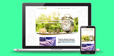
J&J Bookkeeping & Office Services

J&J Bookkeeping & Office Services

Web Development

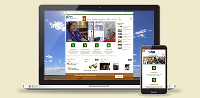
Western NSW Primary Health Network

Western NSW Primary Health Network

Website Development

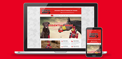
Essential Wrap

Essential Wrap

E-Commerce Website

Outback Pharmacies

Outback Pharmacies

Website Development

Western Queensland Primary Health Network

Western Queensland Primary Health Network

Website Development

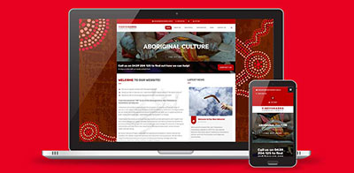
Yindyamarra Consultancy

Yindyamarra Consultancy

Website Development

Western NSW PHN

Western NSW PHN

Information Brochure

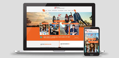
Broken Hill UDRH

Broken Hill UDRH

Website Development

Far West Academy of Sport

Far West Academy of Sport

Annual Report

Maari Ma Health

Maari Ma Health

Information Brochure

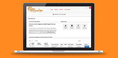
Marrabinya

Marrabinya

Custom Application Development

Western Queensland PHN

Western Queensland PHN

Annual Report

thom, dick & harrys

thom, dick & harrys

Brochure Design

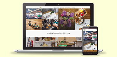
Thom, Dick & Harrys

Thom, Dick & Harrys

Website Development

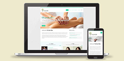
N.E. Chiropractic

N.E. Chiropractic

Website Development

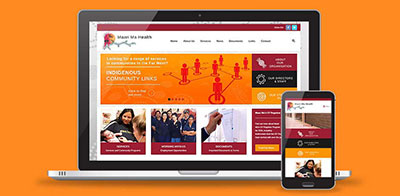
Maari Ma Health

Maari Ma Health

Website Development

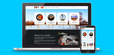
Murdi Paaki Regional Assembly

Murdi Paaki Regional Assembly

Website Development

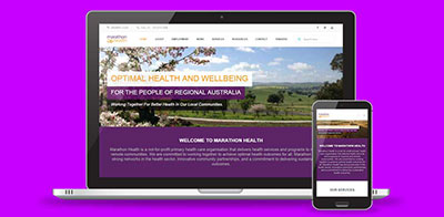
Marathon Health

Marathon Health

Website Development

Resident GP Video Connect

Resident GP Video Connect

Video Production

Captains Blog CAPTAIN'S BLOG, STARDATE 77891.1

business-2717063_640.jpg
Extremely Geeky23Feb2019

Taming Tables : Responsive CSS and JQuery tables

Twitter Bootstrap is an amazing open-source web framework for creating responsive websites. It does an excellent job of saving development time when templating for websites; having a myriad of functions and CSS classes for organising responsive content. When it comes to tables though, things can get tricky - and trying to tame long width tables for mobile devices can turn into a nightmare.


The Problem

Wide tables with multiple columns can often be cut off horizontally on devices with small screens. This is because tables aren't responsive by default, and because of their structure and complexity, making them responsive can be quite a challenge.

Bootstrap does a pretty good job of styling HTML tables and making up to 4-column tables responsive above 600 pixels wide or so, but what we really need on a website is for a table to do the job it's intended for, and that is to present structured data no matter how many columns it might have, on all devices - including mobiles.

Fixing this problem often leads to another problem. The extra code to make tables responsive on mobile devices can often make tables more complex to implement and maintain, especially large tables.

Fixing The Problem

CSS to the rescue!

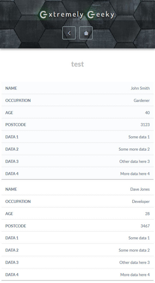
The following CSS code will work well for up to 8 column tables on smaller screen sizes. What it does is to remove the headings (we'll add them back later) and then collapse the columns into rows instead, and uses a little styling to seperate each data row into a visible block (of sorts), so that the user can understand the data a little better.

{literal}@media screen and (max-width: 970px) {
table {
border: 0;
width:100%;
}
table thead {
display: none;
}
table tr {
border-bottom: 1px solid #ddd;
display: block;
margin-bottom: 10px;
}
table td {
border-bottom: 1px dotted #ccc;
display: block;
font-size: 13px;
text-align: right;
}
table td:last-child {
border-bottom: 2px solid #ccc;
}
table td:before {
content: attr(data-label);
float: left;
font-weight: bold;
text-transform: uppercase;
padding-right:5px;
}
}{/literal}

Tables Collapsed


Adding back the heading titles with JQuery (1.11+)

Now we add a new class to the <table> element so that it looks like <table class="table">, and then we need to use the data-label attribute on each <td> element to add the headings back for each row. Rather than manually edit the table code, we can use a handy bit of JQuery to collect the headings and loop through the table data to add the attributes automatically.

{literal}<script>// <![CDATA[
// The array to fill with the table headings

var tableheadings = new Array();

// Function to clean up the table headings text

function cleanData(x) {
return x.replace(/(^\s+|\s+$)/g, '');
}

// Get the table headings and fill the array

$(".table th").each(function () {
var tableHeadingClean = cleanData($(this).html());
tableheadings.push(tableHeadingClean);
});

// Add the headings as a data-label attribute to each <td> element

for(var i = 0, l = tableheadings.length; i < l; i++){
$(".table td:nth-child(" + (i + 1) + ")").attr("data-label", tableheadings[i]);
}
// ]]></script>{/literal}
Tables Collapsed Headings

I hope that this guide helps someone out there to tame their tables!

blog-writing.jpg
Extremely Geeky02Nov2018

How to get visitors to your website - Blog Marketing

Adding useful content to your website is the most important step you can take to get visitors. Whether you're selling services or products - a blog or news section on your website can mean the difference between your website getting seen or getting lost in the crowd.

Website visitors and search engines alike love high quality, informative and interesting content relevant to what people are searching for. It can be difficult to get the creative thought process going to write well-thought-out articles on your subject of choice, but it's well worth the time and effort involved to add more substance to your website other than just a product or service offering. Add social networking into the mix and you have an effective marketing strategy - not only to give advice, offer reviews or your thoughts on a variety of subjects, but also to get exposure for your main business - your amazing products and services.

So how do you get started with blog marketing?

The first thing to do is to make a list of the associated interest areas that your blog (and business) will cover. If you have a website that sells products for pets, then you may want to write content based around cats, dogs, budgies and other cute and cuddly critters, while writing in gentle suggestions for your best reviewed products for those animals.

{CGSmartImage src="/uploads/images/cute-kitten.jpg" filter_resize='w,500'}
Obligatory cute kitten image

Showing just how your business can help with any particular blog subject is important to get customers interested in your business and not just the article. Of course, it's important not to turn your blog article into solely an advertisement for your products and services, as your readers will quickly identify the bias and may immediately dismiss anything you have to say. Be honest and helpful with your articles - it's vital to get your readers coming back for more.

What to do if your writing skills aren't up to scratch?

You may be brilliant when it comes to running your business services or creating amazing products, but that doesn't mean that your skill set extends to writing. If you're not adept at writing great blog articles, or simply don't have the time to write them, then outsource to someone who can. Adding extra strings to your bow of skill takes time and practice, so if you're short on either of those things it may be effective to hire someone who's ready and able to do the job for you.

You can also hunt around for guest blog writers - these are people who will write articles on your website in return for a back-link to their own website, or will work for a fee. Guest blog writers can add extra flavour to your website with ideas that you hadn't previously considered, and if your interests align to a mutually beneficial business relationship, it could be a win-win scenario for you and your guest blogger.

There's a couple of methods to attract guest blog writers for your website. You can add an extra "Write for us" page on your website with a form to collect a sample of their work and to provide details of what you're looking for in a writer (contact your website developer if you can't set this up yourself), or you can search for writers on one of the many freelance writer websites out there - some only charge a few cents per word, or offer a fixed number of articles for a monthly subscription.

Reaching your audience

Adding blog articles can help generate traffic to your website via search engines like Google, or Bing - especially if your blog is set up with good SEO (Search Engine Optimisation) best practices, but it can also pay to be more proactive in your marketing efforts. Adding social media interaction to your website (social media "Like" and "Share" buttons) is almost essential to get your content seen, especially if you've invested time, money and effort into your blog.

If you have a social media account then you'll already be connected to friends and family - and quite possibly their friends too, depending on various privacy settings. If you don't already have a social media account with one of the social media giants (twitter, Facebook, Instagram, Pintrest), then I highly recommend that you take the plunge if you want to effectively market your website on social media. This initial connection to people that you already know gives you a head start in getting your website content shared.

A word of warning - don't upset your friends by continually bombarding them with commercial marketing, or else it can mean that your initial efforts are quickly ignored. It can take a tactful and gentle approach to start the ball rolling, so save the hard line marketing and product offerings for when you have a business-oriented social media account, group, or dedicated social media business page. If you have a great product or service, and back that up with some excellent, well-written blog posts, your friends and family will be happy to like, share and comment on your posts. And it could extend far beyond this with good old word of mouth - possibly the best marketing of all.

As with any business venture, start small and work hard to add great content to your website. Your hard work and persistence will eventually pay off for you so that you can start earning the income that you've been dreaming of.

re-branding.jpg
Extremely Geeky28Jan2018

Thinking of Rebranding?

Having recently re-branded my own business, I thought that i would share some tips on what I learned during the process. Bear in mind that this is not a complete guide on rebranding, because every business is different, but I hope that the few thoughts I have learned here might help if you're trying to decide whether or not to change your business identity.

To rebrand, or to not rebrand, that is the question

Why are you rebranding anyway?

Rebranding your business could be for many different reasons. Most often it is to make your product or service more relatable to your target audience, or to create a fresh buzz on a range of new products or services that you're offering. Whatever the reason for your rebrand, find out what makes your product resonate with your customers and work with that to the best advantage.

Don't compromise a well-known identity

If you have a product that is instantly recognisable by your customers and sales are steady, changing your product design could lead to disastrous results. Customers can often relate a particular product design with reliability or quality, and changing that could result in a backlash. Tropicana discovered this when they changed their orange juice container packaging which led to a drop in customer brand trust. When sales also dropped by 20%, Tropicana changed back to the original packaging a few weeks later.

Too many brand names spoil the pot

The clutter of many different brand names can confuse your target audience. In the early 90's, Federal Express was struggling with having to juggle many different services each with different names. Their decision was to rebrand under the name FedEx with a new logo that is now one of the most recognisable brands out there.

If it isn't broken...

Unless you have a valid reason to change your brand, it's best not to risk confusing your audience with a brand change. Even a simple logo change can lead to a lot of confusion with a well-established brand identity.

Clever campaigns to revitalise your brand appeal

The key here could be to reach new target demographics and broaden your audience, or to refresh your image for your existing demographic - whatever the case may be, generating buzz always starts with something new and fresh. It doesn't necessarily have to be a brand change to get the ball rolling in the right direction, but perhaps a new perspective to challenge common conceptions or misconceptions about your brand. Some advertising campaigns capitalise on brand misconceptions by making fun of themselves - Old Spice and Hungry Jacks (Burger King) are famous for doing this and have had great success in reaching new customers by not taking themselves too seriously. 

If done correctly humour can make your brand instantly relatable if your campaign is backed up by a good amount of solid market research. It can also make your company seem less rigid and corporate, and friendlier towards a wider audience.

Don't be over-concerned with the bottom dollar

Rebranding to increase your profits should be carefully considered. Take a few moments to search Google for the Netflix / Quikster fiasco where Netflix wanted to split into two companies to increase profits by up to 60%, and you'll find a tale of caution (and a loss of over 800,000 subscribers!). It's never wise to alienate your existing customers, especially when they are regularly investing in your products or services.

Rebranding isn't the fix-all solution for every business

It is often best to stay the course and take measures to revitalise your brand. Find out what your weaknesses are and strategise and work hard to fix them.

Competition might force you to evolve or innovate to keep a market presence, and sometimes you might not be left with much of a choice but to take on the inherent risks with rebranding. If you have to rebrand, always let your customers know to ease them into the change. Collect feedback where you can, and if your current brand is already large, make an event of the rebrand with a new campaign, special offers or new services and products.

extremely-geeky.jpg
Extremely Geeky26Jan2018

OKTO is now EXTREMELY GEEKY

Rebranding is often a risky business and is usually much more than just a revamp of your logo or business name, but sometimes you can't avoid having to rebrand your business and choose a new name. This was the situation I found myself in with my own business...

The OKTO / Extremely Geeky Rebrand

I've been trading under the name of OKTO for nearly 5 years, but due to new rules by the Australian Business Register I had to register an official business name. Unfortunately the OKTO name got snapped up before I even had a chance to look, so I was forced to choose another one. A few years ago I had registered extremelygeeky.com for a personal project that never got started. Since what I do for a living is pretty geeky, the new name fit perfectly.

The Logo Change

OKTO Logo

The OKTO logo and name was based around the number 8; chosen for its lucky connotations and the connection to the fact that I first arrived in Australia in 2008. I was playing around with the concept of the number 8 being incorporated into the logo design, and it wasn't until I rotated the number ninety degrees that I instantly saw the OKTO name. I really liked the symmetry, simplicity and iconography of the logo, so it was certainly a keeper!

The OKTO name always had a small problem, though: I had to spell it out whenever I told someone my website address or my email address over the phone. It was something that I hadn't originally anticipated although fortunately, the name was pretty short, so it wasn't too much of an issue. Despite that small problem, the logo and name had worked well for me over the years, so I wanted to keep some semblance of the symmetric concept in my new Extremely Geeky logo.

The Extremely Geeky name isn't very symmetrical by itself. I was working with circles in photoshop, scratching my head, and wondering how I could work some sort of symmetry into the logo design. A circle became a power icon, and then my wife suggested that I rotate the icon ninty degrees, and it suddenly dawned on me that the sideways power icon could be used for both the E and the G of the Extremely Geeky name. It was a real eureka! moment, and the concept gave my new business logo the kind of weird symmetry that I really liked.

A New Brand is Born...

Extremely Geeky Logo

I decided to turn my new logo into a font and then, at the clever suggestion from my wife, Nikola, I added a little bit of JavaScript magic to make the power icons pulse with a green glow. A huge range of CSS effects meant that I could style the text in lots of different ways too, which makes it much more versatile than just a static image.

DROP ME A LINE...


LOCATION

Share this page

Extremely
Geeky

Get a Free Quote